When you get to the Google home page, you’re faced with an uber-simple interface and yet on the other side is a virtual library that has indexed trillions of webpages. There are so many interesting things we can learn about both the home page and the search results themselves.
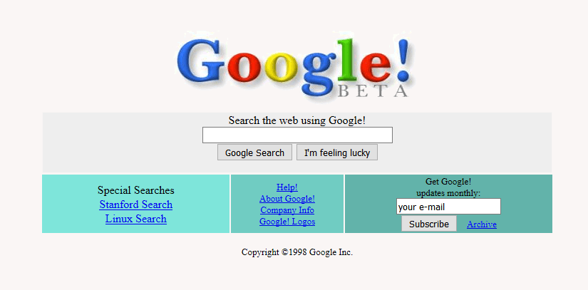
Let’s first take a look at how the Google home page has evolved over the years. Here is a sampling of screenshots from 1998 – to today – of the Google home page.
1998:
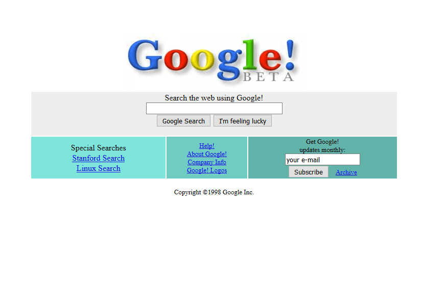
1999:
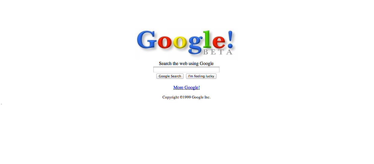
2000:
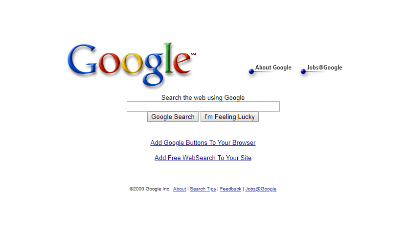
2001:
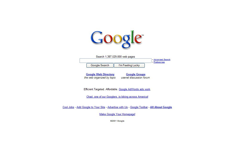
2002:
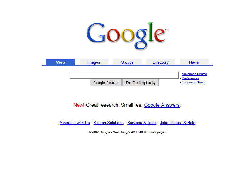
2003:
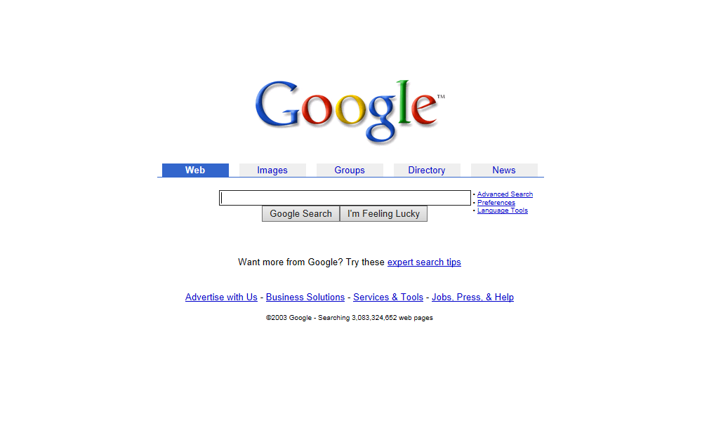
2004:
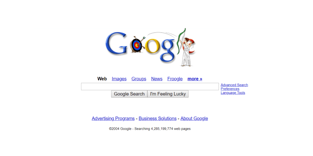
2005:
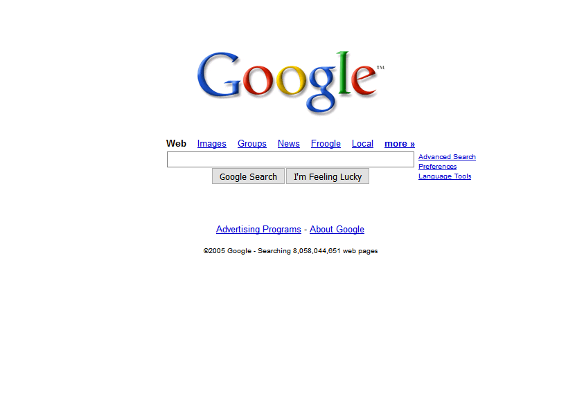
2006:
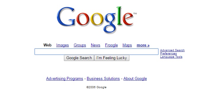
2007:
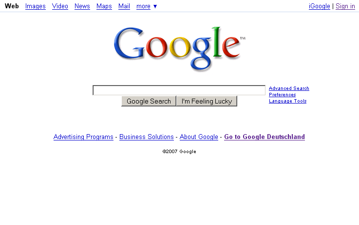
2008:
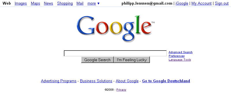
Aside from subtle branding changes, surprisingly, the Google home page doesn’t change that much up until 2009-ish. They kept it pretty clutter-free and simple. When we reach 2009, it gets even simpler.
2009:
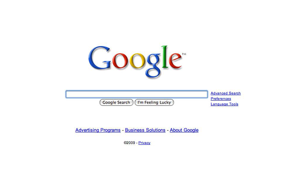
2010:
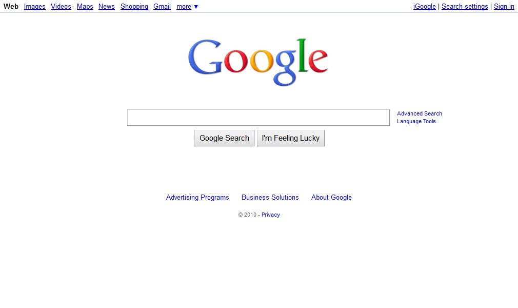
2011:
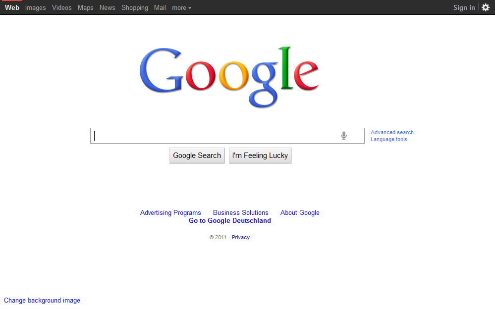
2012:
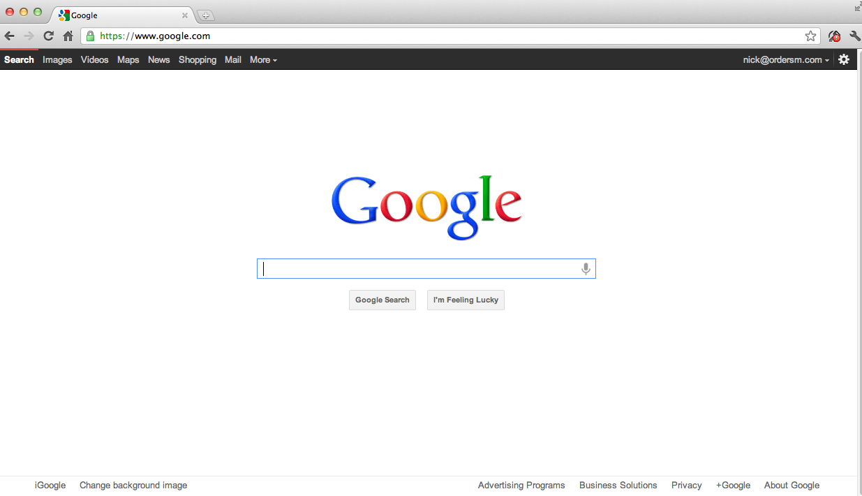
2013:
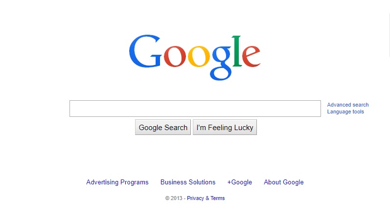
2014:
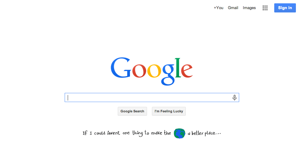
2015:
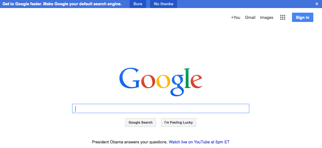
2016:
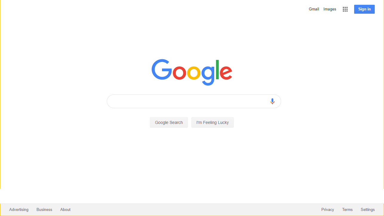
2017:
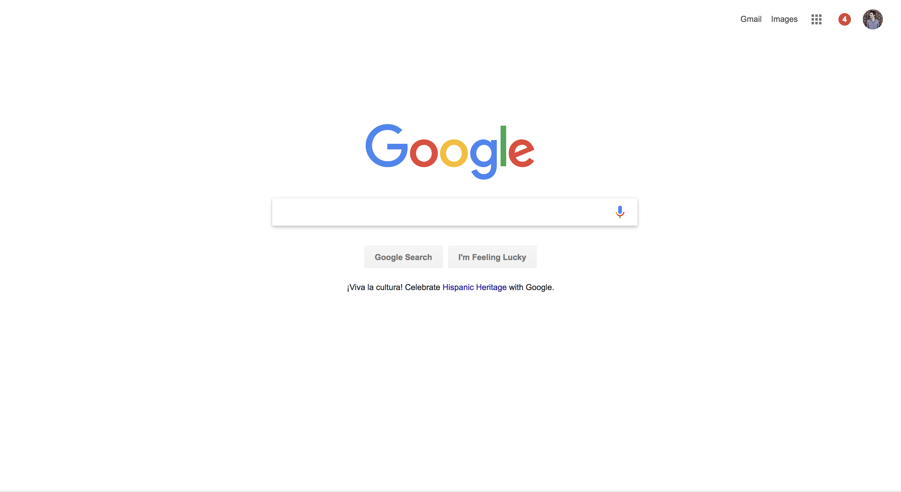
2018:
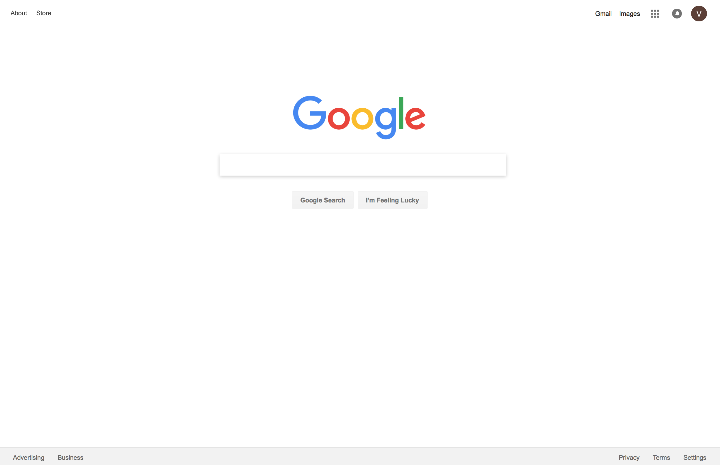
2019:
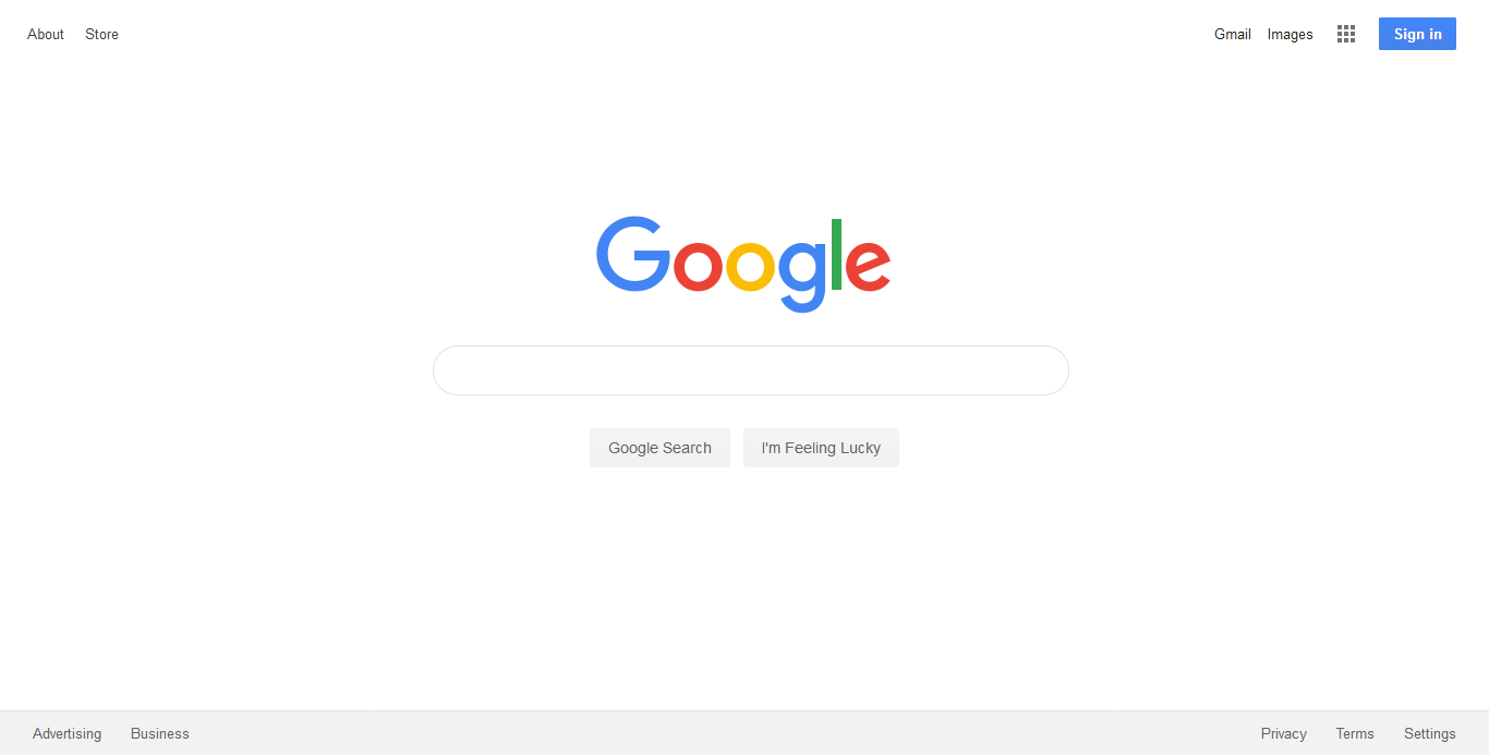
Pretty consistent experience eh?
There is a reason for this – they want you to focus on one thing: performing a search query.
If we looked at any of the other search engine home pages from last century (wow it sounds so insane typing that!) like Yahoo, AltaVista, Lycos or Hotbot, all of those search engines had tons of calls to action on their respective homepages.
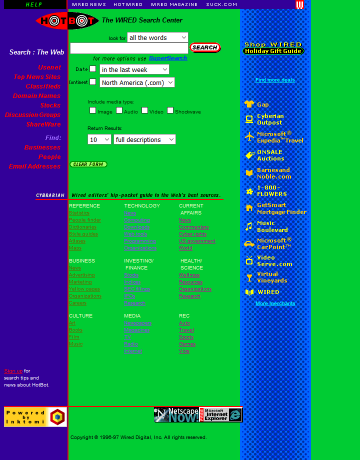
The HotBot homepage circa 1997. (Image Source)
That meant your attention wasn’t really focused on SEARCH. Google’s strategy was different: Keep it focused to JUST searching.
Who is this?
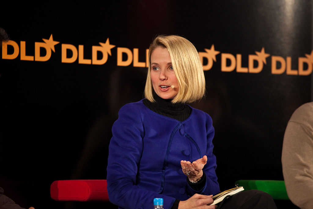
She was the gatekeeper of Google’s homepage. She was also known for saying “no” and that held true for any proposed changes to the home page.
Her name is Marissa Mayer. She was Google’s 20th employee, the company’s first female software engineer and designed the search interface of Google’s home page.
Marissa was the product manager for Google Search for more than 10 years. She left Google in 2012. During her time at Google, daily searches went from just several thousand to more than a billion. One of her revealing quotes, “I think Google should be like a Swiss Army knife: clean, simple, the tool you want to take everywhere.”
I think we all owe Marissa a huge thanks for having the backbone to say no to bad ideas, poor design, and short-term impulsive thinking. She’s a hero of all the people that live by the motto: less is more.
How have the Google results pages changed over the years?
Now, let’s take a look at the Google search results page. The one that comes up after you type in your search term and hit enter.
Going back to 1998, you’ll see it comes up with your basic 10 listings and no ads.
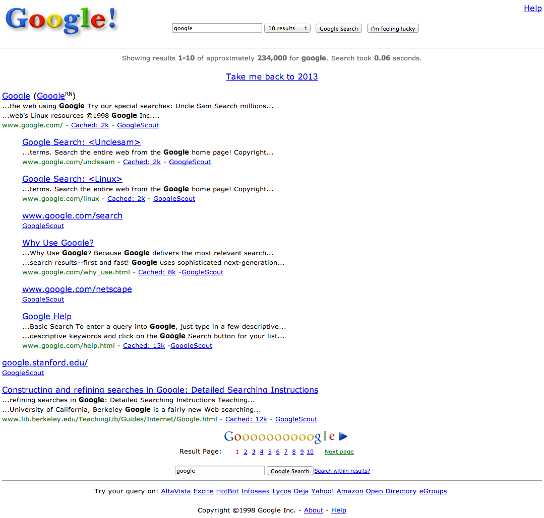
This screenshot is from around 2000.
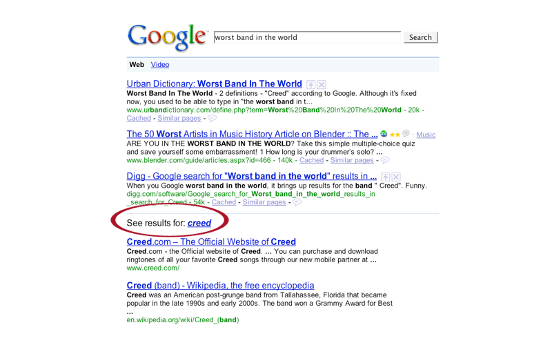
This search results page is from 2005.
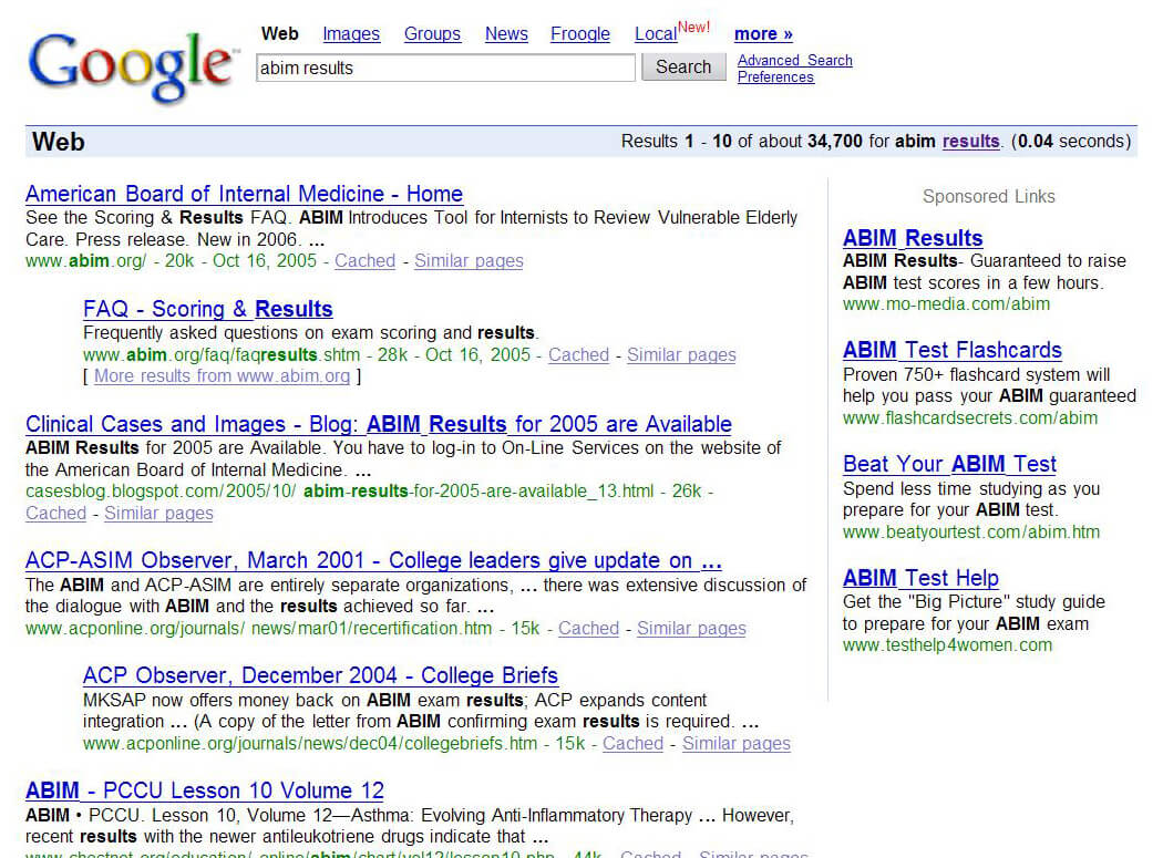
We are starting to see ads on the righthand side. However, you’ll see the clear delineation between the search results and the ad, marked by a vertical dividing line.
As we move further forward, things stay pretty much the same until about 2012 when we start seeing a great deal more happening on the Google search results pages.
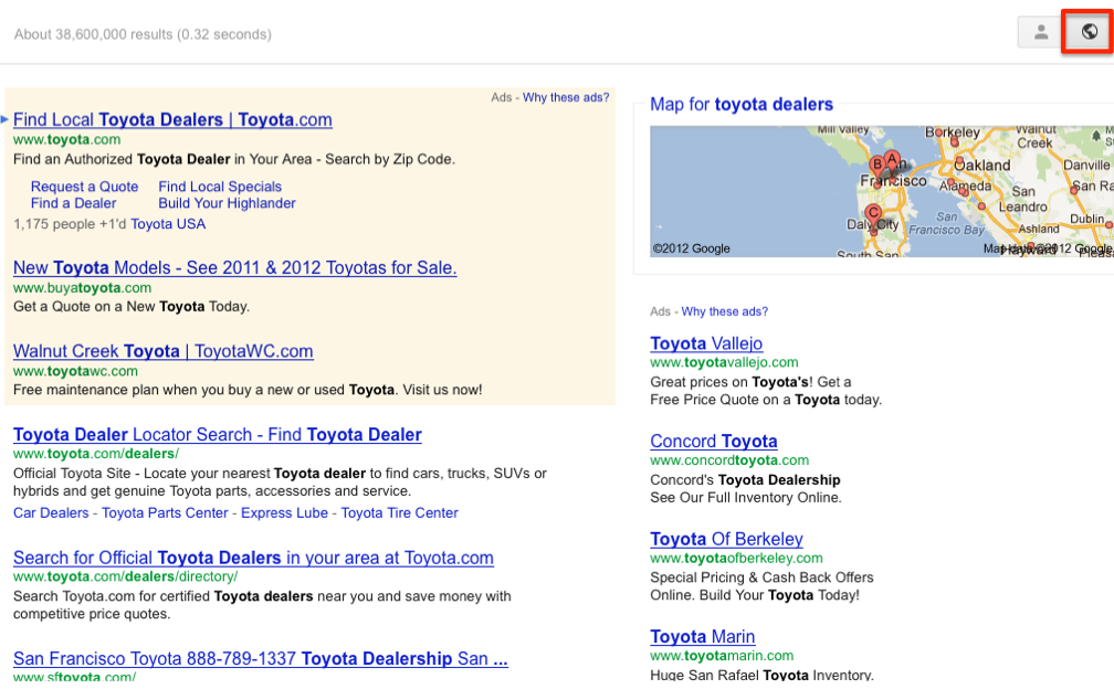
We have an ad panel on top, now, highlighted in a buff background color, with the search results below, a map in the far upper right of the page, with the ad panel down the right side of the page with less of a dividing line between search results and ads.
You are also seeing a lot fewer organic results, which are the listings from websites, that no one has to pay for, since Google goes out and finds them to add to a search query to make it a good match for your keyword input.
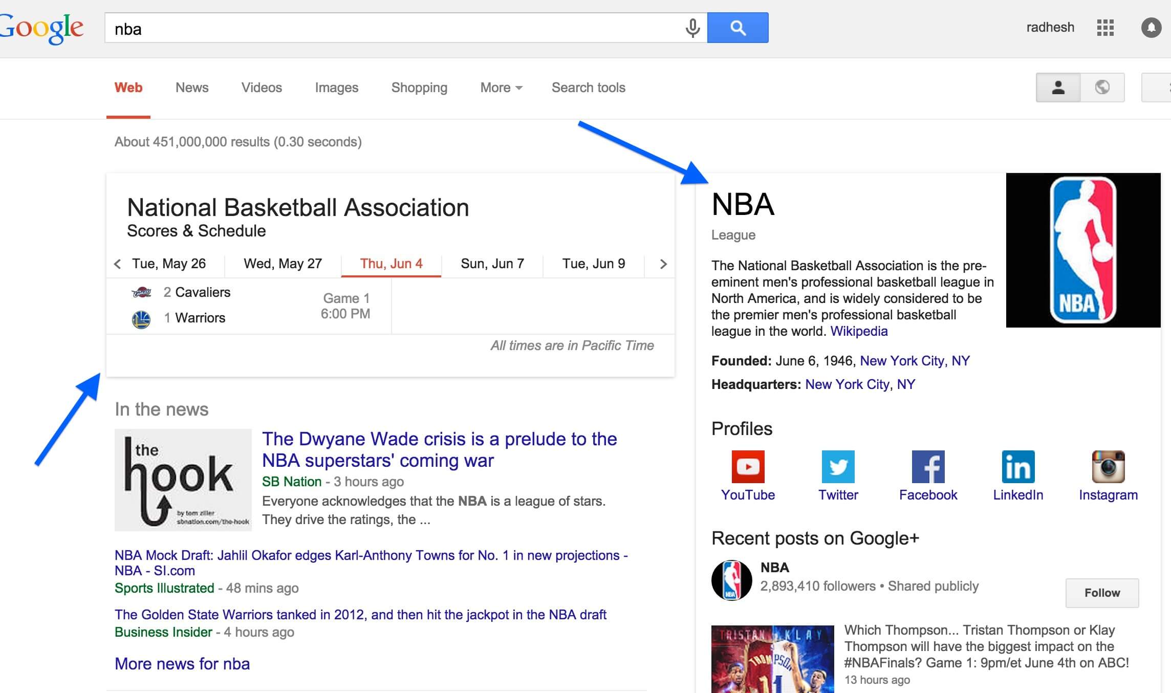
By 2016, the search results page is popping with all sorts of information. They’ve added new informational panels and they are even bringing in their own search results analysis and news items.
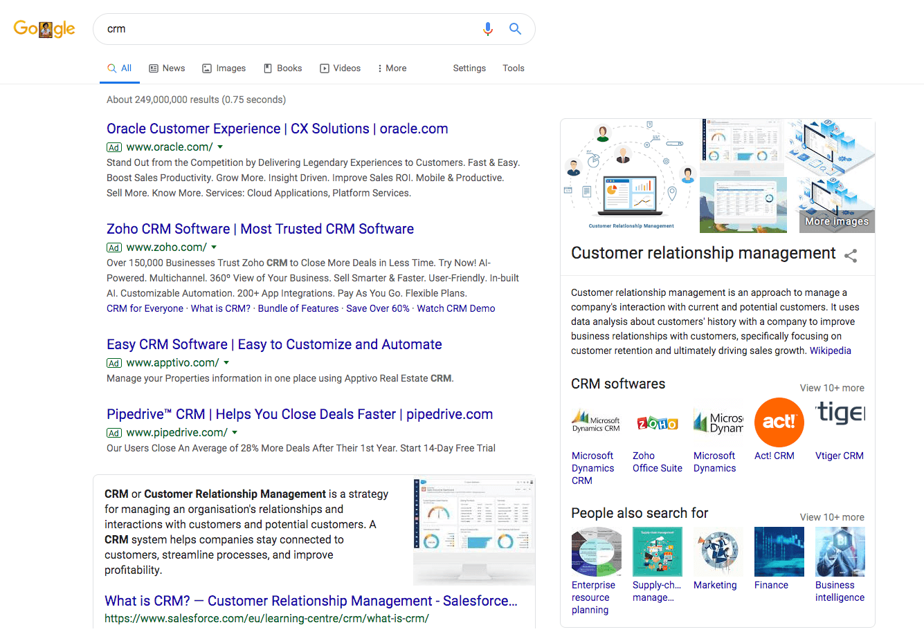
This year, I did a simple search by typing in CRM, the acronym for Customer Relationship Management software (software where you store all your business contacts and info). You see ads everywhere and a big informational panel. You only see one organic result above the fold. That’s it.
So what does this all mean?
Even if you rank on the first page of Google for a certain keyword, even for your own website, the chances of you getting a click-through have lessened greatly.
Why is that? Because Google is a publically traded company and one way to increase revenues is by expanding its advertising program.
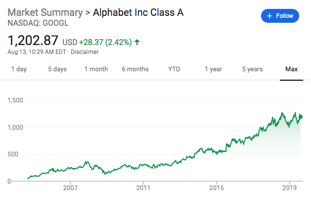
Google has increased revenues, pretty steadily by including more advertisements on its search results page. And maybe even more pronounced has been how much “real estate” that advertising is taking up on the search results pages.
In order to keep shareholders happy, they’ve had to effectively reduce the “real estate” of the organic Google results (the non-ad listings).
So what is a website owner supposed to do?
There are only three ways* to use Google to increase your business.
- Write long-form, textual content that describes each service you provide. Blog posts also help.
- Create ads and pay for advertising space on Google.
- Do both.
You’d be surprised at how many businesses don’t bother with the first step to include much content about their services or products.
To get the best out of the first point above: If you have a website with a services page, you should consider writing extremely long explanations as to what services you provide, why you are so good at it, how your services improve the lives of your clients, include testimonials so people get a great deal of information.
In other words, create an end-all-be-all webpage for each service you provide. This is how you get more traffic from Google without paying.
The second option is to run ads.
This works for a number of businesses and with the right approach, it might work for you. If you aren’t sure how to proceed, feel free to schedule a quick chat with us below and we can explain how it works and whether it’d be a good fit for your business.
If you’re interested in executing a rock-solid SEO and Google Ads strategy, please schedule a chat with us to discuss how it can be done.
*For businesses that serve humans in the flesh, have a storefront, non-internet businesses – there’s something called local search engine optimization which is a great avenue to explore.


