
It may be hard to believe, but images can generate a lot of traffic for blogs. When you type something in Google search, not only do text results show up, images also come up.
Step 1: Don’t Forget To Optimize Your Image Alt Tags
To be found on Google you have to tell the search engine spiders what they are looking at (they can’t see) by making a descriptive alt tag. An alt tag will usually appear in an image HTML code completely blank or with some random gobbledygook:
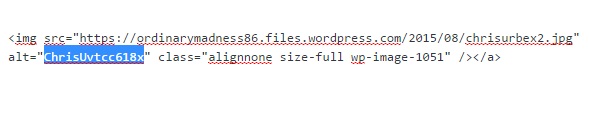
An example of a bad image ALT tag
To optimize the alt tag, just insert a very descriptive description – almost as if you’re explaining the image to a blind person:
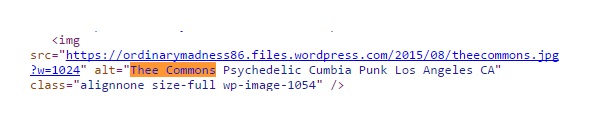
And here’s an example of a good image ALT tag
And that’s it! Don’t try to keyword stuff your alt tags because Google might ding you for spamming or over optimization.
Step 2: Keep Image File Size Down
In order for your blog page to load in a timely manner, it’s best to use a .JPG image because easy to compress big image files down to small files. Easy meaning there are a lot of options out there that will let you compress your .jpg images:
- Photoshop
- GIMP (like Photoshop, but free!)
- TinyPNG (web-based and free!)
Having the image as a .jpg file allows the page to load faster without compromising the quality of the image (not recommended for Photography type images). It’s important to keep these image files under 100kb for page load time to be optimal. With today’s modern technology it’s also important to consider responsive images.
Step 3: Responsive Images
A responsive image will respond to any device instead of being a fixed sized image. This is important because your page will look good on all devices, from tablets to mobile phones. The good news is that if you can use the backspace button, you can have responsive images too! Open up the image code for the image you want to make responsive, highlight the width and height dimensions…
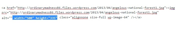
…and delete it. Removing the preset height and width dimensions allows the image to be free to respond to any devices screen size.
Get Smarter With Your Marketing — In Just 5 Minutes a Month
Join thousands of small business owners getting simple, actionable tactics they can use today to grow their brand.
Share This Post:
Share on social media by clicking one of the buttons below. Use the + button to see more options.