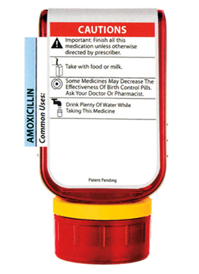
"That well-designed prescription bottle, for example, is well-designed because it gets you to take your medicine even when you forget or don't feel like it. If that wasn't the goal, then a cheap Baggie would do the job.
And that well-designed web site doesn't encourage aimless clicking and eventual ennui. Instead, it pushes the user to come face to face with what's on offer and to decide (hopefully) to engage."
- Seth Godin, August 26, 2013
I like that one, Seth. That's a timeless quote.
And hopefully, that gets you thinking about how you want your website to be designed.
There's a pretty simple rule to remember when it comes to good web design: Remove distractions and get your visitor to focus on your number 1 goal you want them to accomplish.
But it becomes so tempting to include a "sign up for my newsletter" button here, and a "read my latest blog post" there. Oh, and a "please call me" over there. Because you want your visitors to do all of them, or at least some of them doing one thing and others doing another thing.
The good news is you can have your visitors do all of these things if you design your site well. But if you do what most site owners do and plaster your home page with 101 call to actions - your visitors are usually going to accomplish anything but what you really want them to.
We've got your fix.
Not only have we built hundreds of websites over the past 20 years, we've published hundreds of articles on conversion optimization and web design. We know how to guide your website visitors to your most important goal.
If you're ready to dive into a new website or redesign, we built this handy-dandy form below. Not only will it get you thinking about some the important first steps, it will help us guide you through the rest of the process.
Feeling Chatty?
We love sharing our expertise and helping businesses improve. Feel free to
message us below:
